Web Design in a Non-Profit World
The Director of Communications and I started working for our non-profit around the same time. The first mission: re-design the website!
For starters, there were too many pages and too many messages which made navigation a challenge. Those pages were also very text heavy, and the content management system was quite finicky! Apparently, we were not alone. Sites may be thrown up “just because,” with no one in charge of its overall cohesiveness and message. There may not be enough time or resources to think through and implement an awesome website that supports key goals.
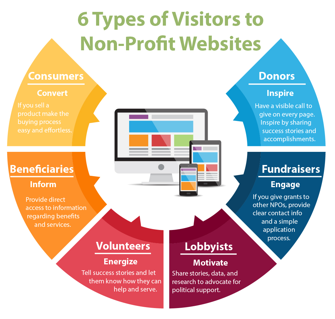
The hard part could be determining what the goals are. NPOs have many constituents. One NPO may have beneficiaries, loved ones of beneficiaries, donors, volunteers, political lobbyists, and more! Each segment needs information particular to them, has should have distinct goals. The NPO may want to inform one group while converting another.
How to start?
The Director of Communications started by finding out which pages people were currently visiting. When I walked into his office, I saw printouts of the website plastered all over the wall in the form of a sitemap. He marked the most frequently visited pages based on data from Google Analytics. He identified which content was the most important and cut the rest.
With his background in design and my photography skills, the new website was launched! It is visually engaging, clean and straight to the point!
Check out the infographic below to see who may be visiting your organization’s website. 🙂


